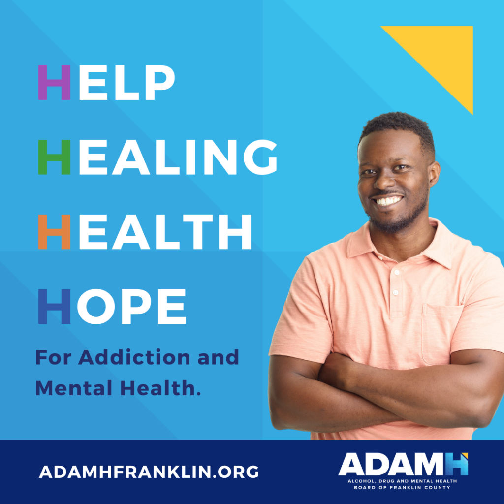
ADAMH has a new look and messaging that reinforces the value that our network of caring providers and ADAMH bring to the community.
The H represents help, healing, health and hope – the core elements of our collective work.
The elements that make up the accentuated H:
- A textured geometric pattern represents the network of providers that all work together to help individuals improve their health and well-being.
- The light blue “H” represents the support that the ADAMH-funded agencies provide to those in need along their path to health and healing.
- The yellow, forward-pointing triangle represents an upward movement toward a feeling of hope that keeps those we serve motivated, active and in tune on their path to recovery.
This updated visual identity is the foundation for an integrated marketing campaign that will launch later this month. The brand refresh should be viewed as a timely reframing of community-based mental health and addiction services available through the ADAMH network of provider agencies and help reduce the stigma of seeking care for mental health and addiction.

